Design Thinking
TableforYou
Nowadays you can pay for almost everything with your card or your cell phone, as well as choose your food delivery through apps (Just eat, Glovo…) and make reservations to go to a restaurant.
But, don’t you find it a headache to be calling to see if you have table in a restaurant? You have to call a long time in advance, if you go to the restaurant many of the waiters are full because they have too many diners and they are not so many. To order the menu you have to wait, then order the food, another time for the bill… when all that can be improved.
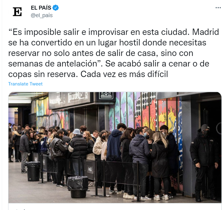
Now that we have read the brief, we understand the problem. We are going to find a solution through the Design Thinking methodology…
Research and Analysis
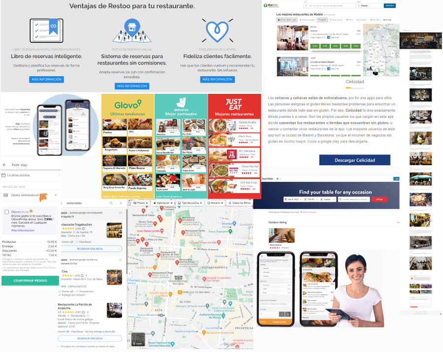
In this phase I would like to find out more about customer reservations and how restaurants manage reservations, orders and payments.
Findings
- As a customer I have found several apps or websites to make the reservation.
- The functionalities I find when viewing the menu
- Payment methods.
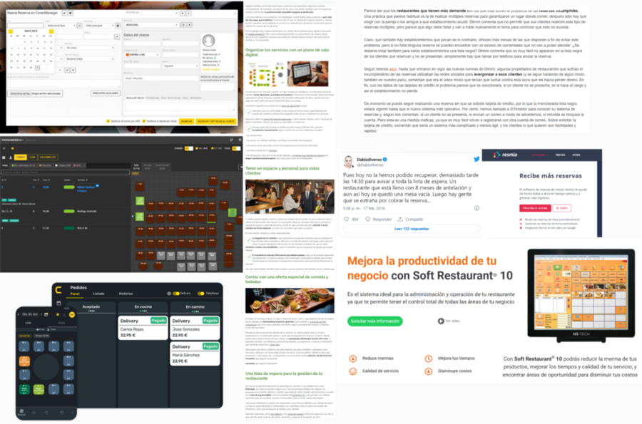
- Software to manage the tables and reservations in the restaurants.
- Payments and orders in the platforms used by the restaurants.
Now I have a lot of information but I feel that I am still missing something, for example questions come to my mind: how do most people usually make their reservations? Can you really see up to date availability of tables? Since I had a lot of doubts, I did my Research Questions
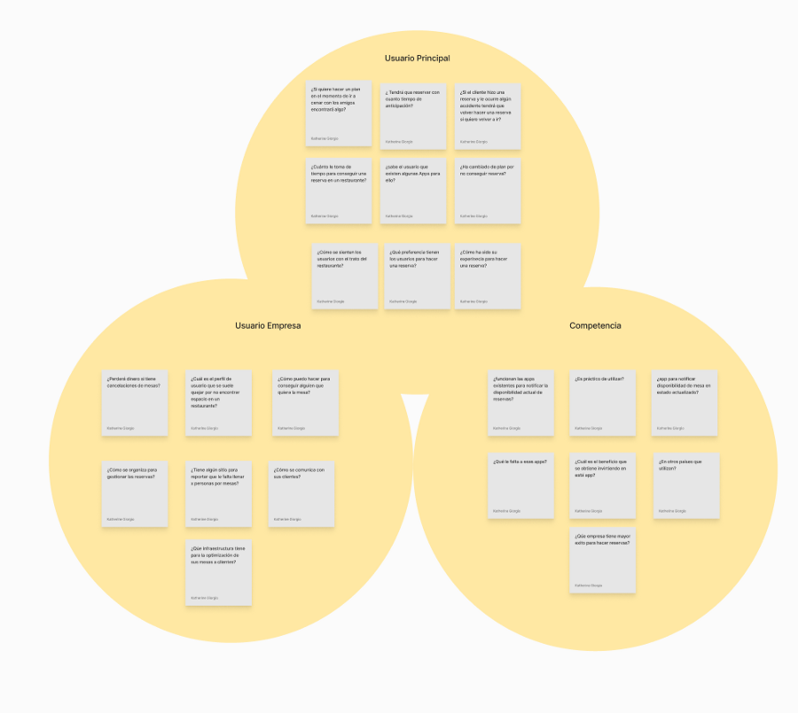
I need to do some customer surveys to find out what their experience is like when taking reservations and when they are in the restaurants. Something very important I think is to talk to a person in the industry to know how they manage through these processes.
Questionnaire
In this section, I chose the answers that I found most interesting 👇
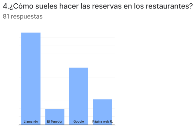
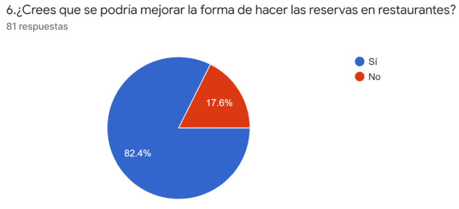
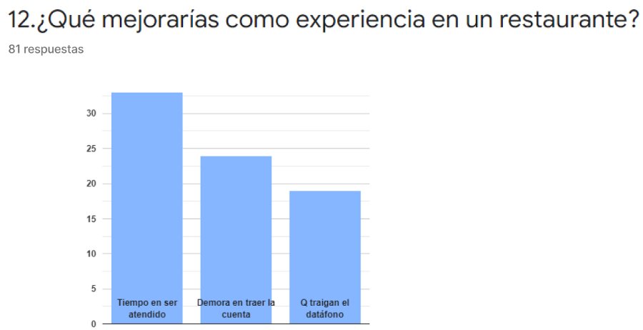
With this survey I was able to get some insights on how they would like their experience to be from the moment of booking to paying the bill, the most interesting ones were:
- Being able to have a faster way to book, taking into account the area you want, the day and times.
- Choose whether you want a terrace or a lounge.
- Integrate the reservation system and menu .
- To book and pay digitally in a simple way.
Interview
Now it was time to generate a discussion with them to find what they WANT, KNOW AND CAN about the topic we propose.
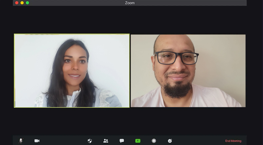
I had the opportunity to do it with Javier, a person who has 12 years of experience as a waiter and head waiter and has worked in several restaurants.
Insights
Reservations are updated instantly as it is the same application for them as for customers (CoverManager).
CoverManager is a software that is used by all restaurants and is instantly synchronized with all reservation applications such as El Tenedor or Google.
Since covid they used to use QR and it helped them, but now that they have returned to paper they feel that it wastes time since they have many tables to attend.
They have no problem sending the voucher by email since the data stays in the reservation program (CoverManager). But if the person is not there, they have to enter their information.
Conclusions
I felt that this interview provided valuable information about their needs, knowledge, desires, motivations, frustrations, values, satisfaction and overall experience.
Now it is clear to me that when customers make reservations it is updated instantly thanks to the software that restaurants use, but it is interesting that customers think the opposite and that many would like to make the reservation having a more personalized way and choosing the site.
What can we do now?
Now we have to put ourselves in the user’s shoes, which is not an easy task. Sometimes users will not be aware of their needs, we will have to dig into their daily activities to find out what they need.
User Persona
A good digital product/service is achieved when the team that develops it cares about the User Persona that uses it.
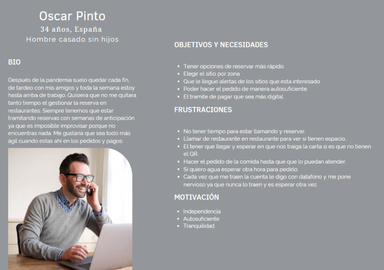
Our User Persona, Oscar, is very busy at work during the week, but on the weekends he loves to socialize and spend time with his friends and family, and usually goes out to a restaurant. This means that he has to keep trying to make reservations.
One of his frustrations is not having time to call to make reservations or not finding places in the area where he is meeting his friends. And also he doesn’t understand that every time he goes to pay the bill he is going to pay by card and they never bring him the TPV, just the bill, meaning another 15 minutes that he has to keep waiting.
User Journey
This information helps me to identify pain points to turn them into opportunities and generate satisfactory experiences for the user during their interaction with the product, service or company. It was very useful for me, since it is giving me ideas of what the product has to have if it meets their needs.
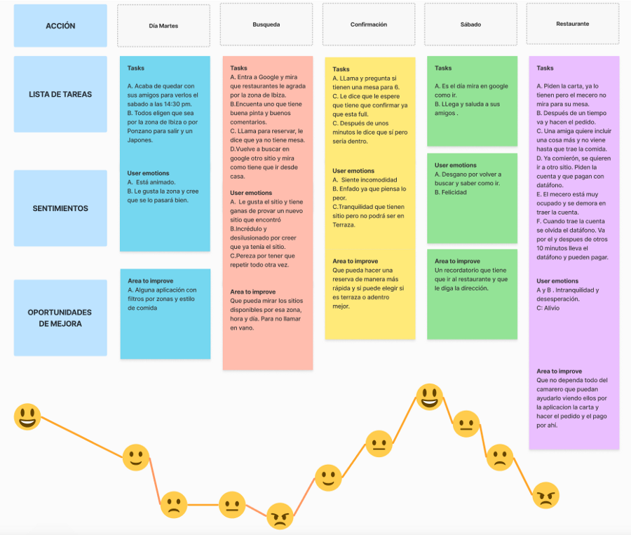
Because of the Internet, new consumers have become more impatient. If they buy something, they want it now. They value super-tight delivery times, mobile apps that help them save time, and they’re even willing to pay more for something if they can get it right away.

Now it’s time to enter the second phase of Ideation and Prototype.
Ideation and Prototype
Point of View
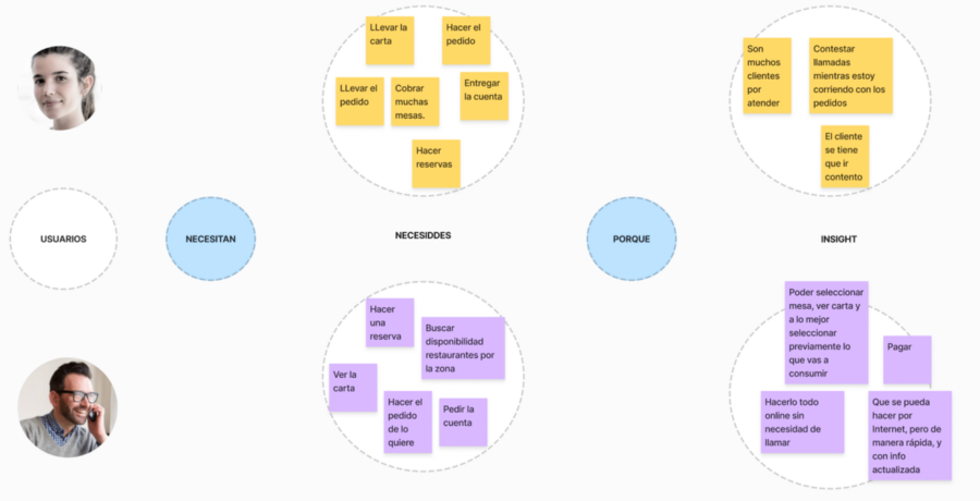
I need to synthesize the user’s difficulties and the causes in order to carry out a subsequent study to find out how we could solve the problem.
I am going to analyze the main user and a waiter so that I don’t miss anything, since I want to obtain an effective product and for that I need to know the impediments that the waiter usually has and facilitate the process for the end user, so that he/she is more satisfied with the overall experience.
Brainstorming
It’s time to throw out all the ideas that come to mind, the ideas that arise from what the user needs to do.
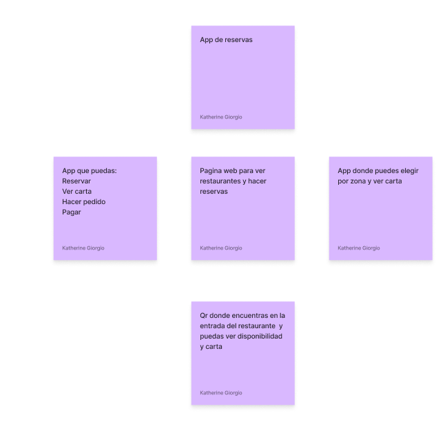
I have a clear understanding, the user needs an app that can offer to make a reservation with better filters to choose the day, the time, the area and be able to see the menu, use it when he is in the establishment, place the order and finally the bill appears in the application and can pay directly.
Benchmark
With the results of the research and surveys, it seemed to me that it was necessary to benchmark the applications most used by users. Once we got the idea, it is necessary to identify the competitors and analyze them to obtain good and bad practices. This time it would be with Google and TheFork.

- After completion I know the good and bad features of each alternative, and comparing with the insights of users to design a complete app with all the needs that are required.
- I have discovered a few points that these two apps lack.
- For example, neither offers me a filter to book and know if I want it on the terrace or indoors.
- Also having the option to see the menu, that in some restaurants is available at TheFork.
- And finally, Google and TheFork do not have the ability to place the order, see the consumption voucher and make the payment in the same application.
MoSCow
Now we need an order, so we prioritize functionalities and features of the idea.
🟢 Must
🔵 Should
🟡 Could
🟠 Won’t
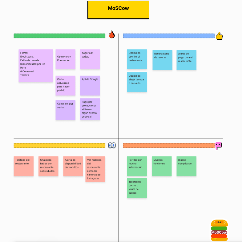
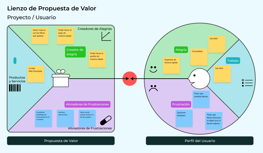
At this stage I need to observe my user’s pains and frustrations.
- What risks and frustrations do you face?
- What makes you feel bad?
- What are the unwanted costs for the customer?
Business Model
At this stage we generate empathy to guide the development of innovative ideas.
These new ideas or designed improvements need to enter and position themselves in the market by clearly identifying their value proposition, knowing where to find the user and become a profitable business.
- How do we create value?
- How do we deliver value?
- How do we capture value?
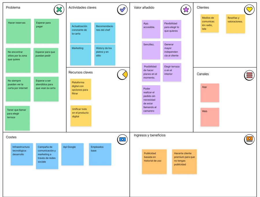
This whole task was very useful, as it has helped me to think how I am going to distribute the product to reach the final customer, the strategy to give visibility and publicity to the product and service. Knowing how to monetize the idea. To see key resources, physical, intellectual, financial and human, that should not be lacking for the product to be a success in the market. Think about who my business partners will be and what strategic alliances I will make.
Information Architecture.
Content organization and structuring, content labeling, information retrieval systems and navigation provided. In order for the user to better interact with the solution. This is done in whimsical.
Flowcharts
At this stage I was in charge of interaction design, a graphical representation of the series of steps or actions that the user requires to achieve the objective. Develop the flow of the applications to facilitate the user’s tasks, defining how the user interacts with the function.
We have two entrances to choose from, one is to make the reservation in a more specific way by choosing area, how many people are and available times. While in the second flow you find the menu and that is where you can place your order and pay your bill.

It was necessary to compare the workflow of different tools or competing systems, which I had previously reviewed in the benchmarking, in the form of flowcharts.
It helped me to understand and think about how the user will interact before, during and after with the content of our product or service.
Wireframe
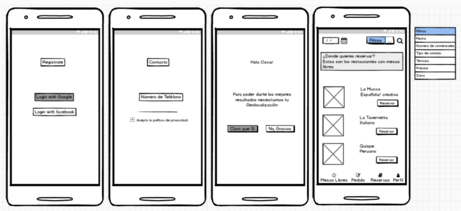
I made the wireframes in Balsamic to understand and conceptualize our app TABLE FOR YOU.
- The new user will be presented on the home screen with the option to register with a social network account.
- On the next screen register your phone.
- In the third screen connect the geolocation, as it is very important to help you in the filter if you want to be near the area where you are or choose another one.
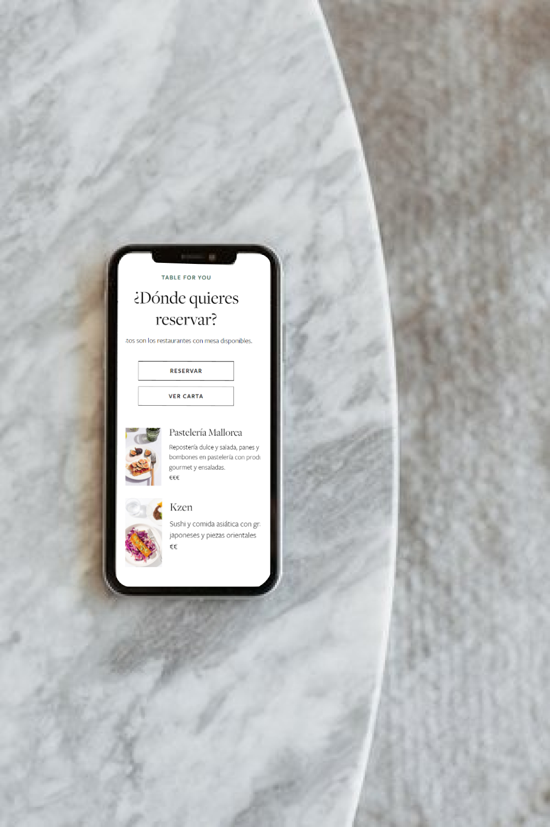
- In the fourth screen you will automatically see the restaurants near the area that you have selected. In the upper part you can set the filters you need, which are the date, number of people, type of food, terrace, prices and the area you want to search.
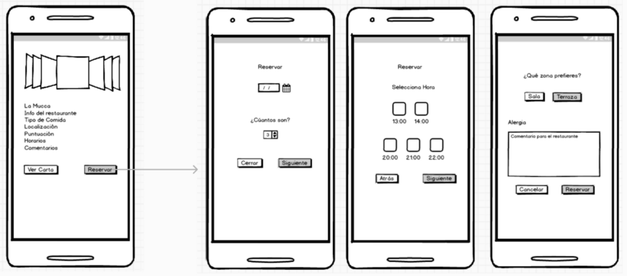
- In this screen you have two options: to reserve or to see the menu. This time we go for the booking flow.
- In the next screen you have to confirm the date and how many people would be.
- After clicking next on this screen you will see the available schedules for you to choose from.
- Finally, in the reservation you can choose the option of what area you prefer in the restaurant, whether it is on the terrace or in the lounge.
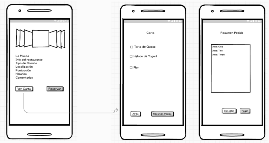
In the second flow:
- In the next screen you see the menu and a checkbox where you can mark and put the quantity of the order you want to place.
- On the last screen you will see a summary of your order and if everything seems correct, you can click on the option to pay.
Color Palette
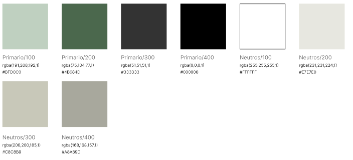
I have chosen shades of green because it is the color of nature and is one of the main emblems of healthy living, besides green stimulates the appetite.
The range of neutrals has a tinge of yellow that conveys joy and stimulates the desire to eat.
Typography
In our app TABLE FOR YOU we select three typographies:
- The brand: Futura- Pt- 400
- Titles: Freight-display- 400
- Text: Freight-sans- Pro – 400
Conclusions
This is the solution I have come up with for the requirements of the test. I really enjoyed the whole process. It has been very enriching for me, at the same time I have learned about users and their insights, also learning from pages that are very good but, I have not yet found an app that has all the needs of users in the same app, and it was attractive to know how restaurants manage reservations.
As a futurible I would like the first home screen to be different from a new user to one that already has an account and has used the app before. Another thing I would like to do is testing the app to see how people like it, their opinions and the way they interact. Finally I would need to do a benchmarking of apps in the menu and orders, to improve that part and make it more practical and functional.
Thanks for reading this far! 💛
Kate
Here is the Spanish version.